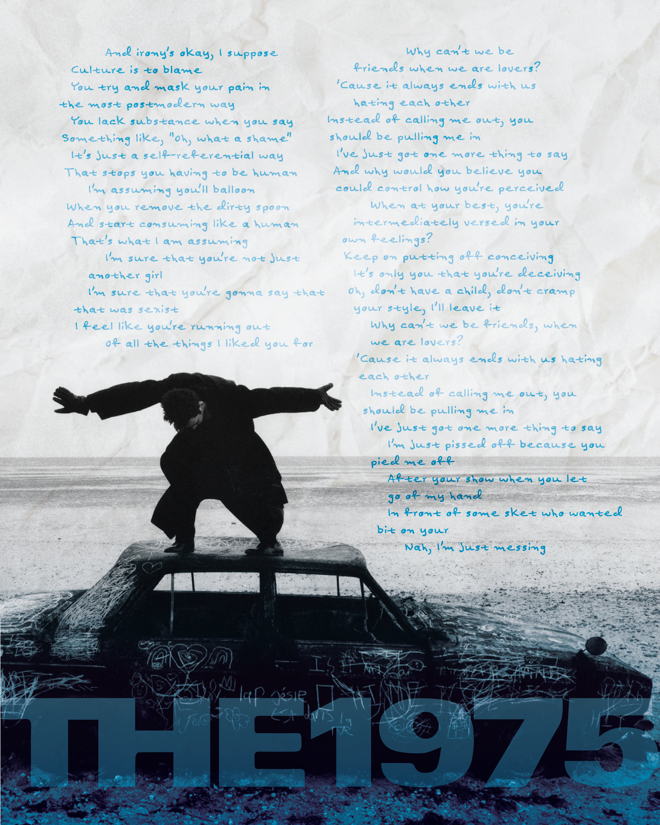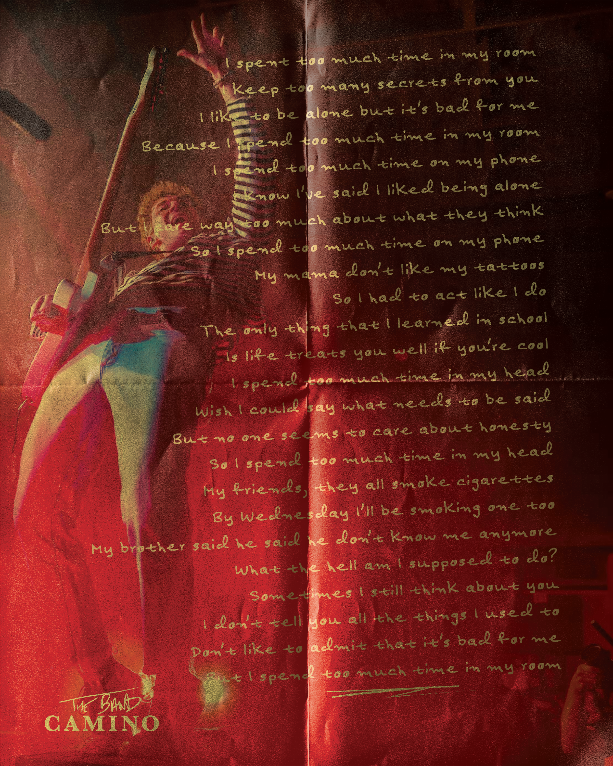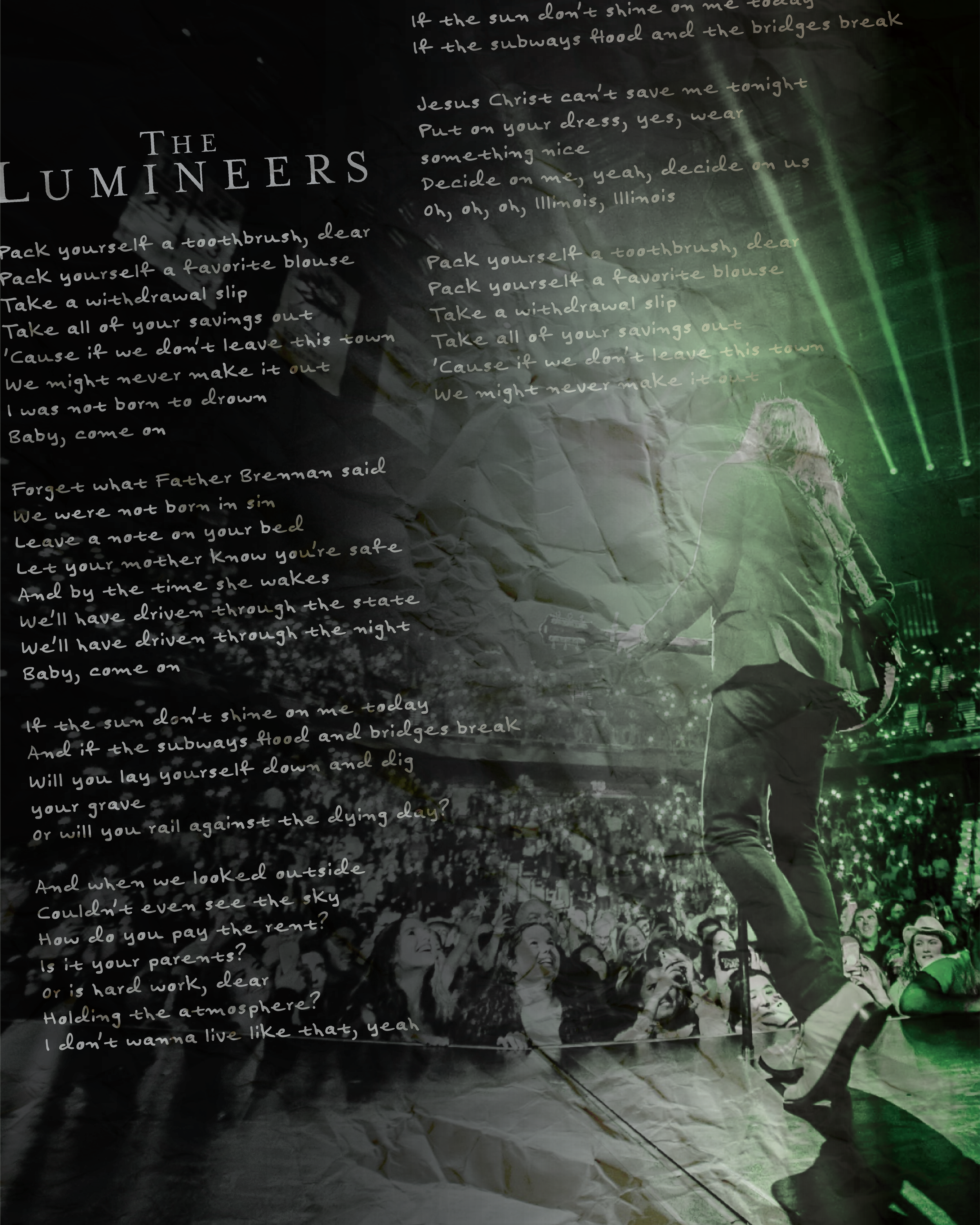
lYric band poster trio
Brief:
Design a poster that illustrates my brother’s favorite three songs by his favorite bands on big posters to be framed.
Approach:
I knew I wanted them to feel a bit aged or vintage, so I edited the background images to feel more like film that was printed on low quality paper. I also picked a main color to focus on, so a warm red, a cool blue and a vibrant green. I arranged the lyrics to all three songs in a way that felt legible, but still artistic. I originally had a more postmodern design, but ended up settling on the importance of legibility, since he loves reading the lyrics so much.
Result:
Three posters that felt like a cohesive group, while also standing alone with their own “vibe.”


