botani wine
posters and packaging
Brief:
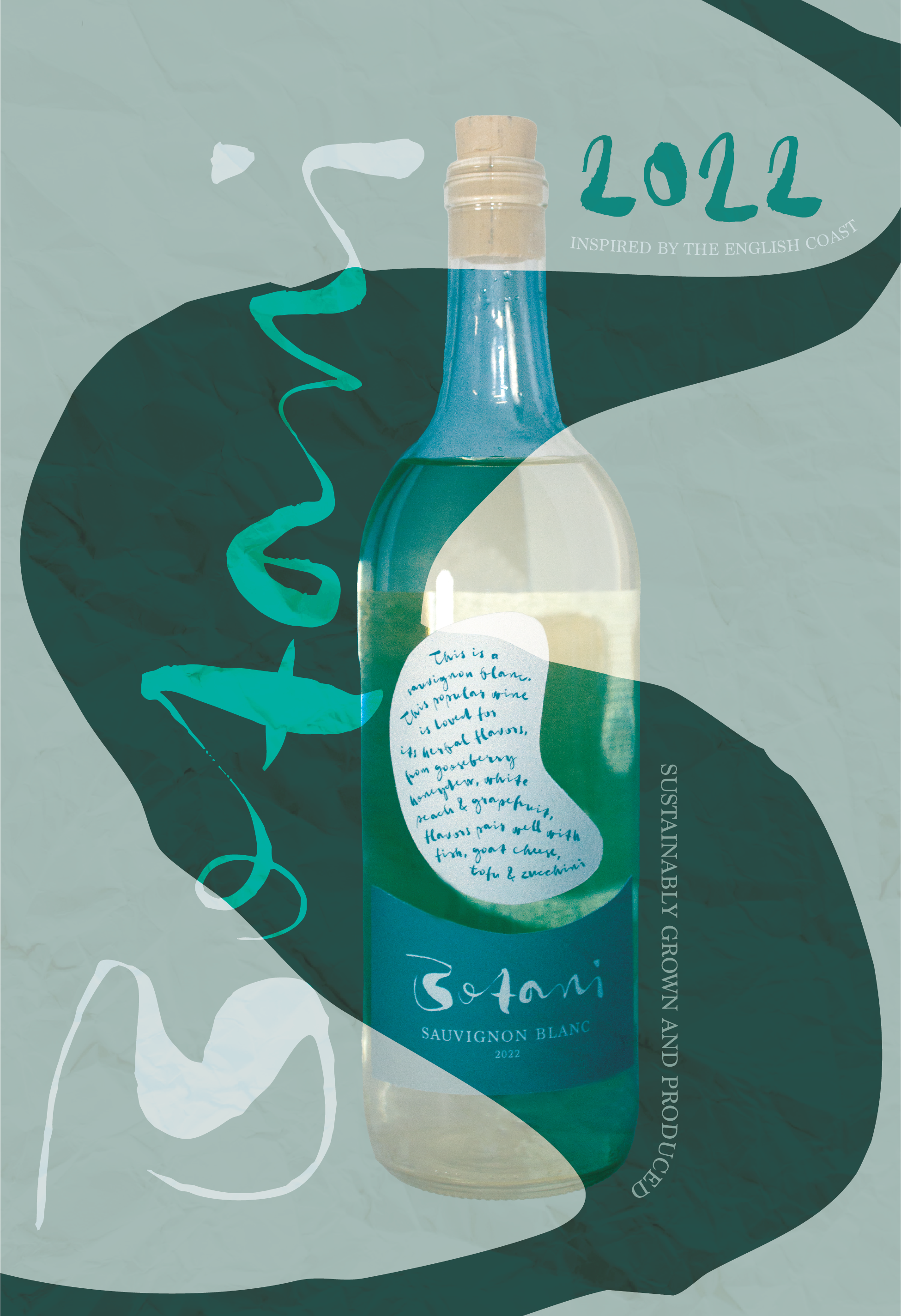
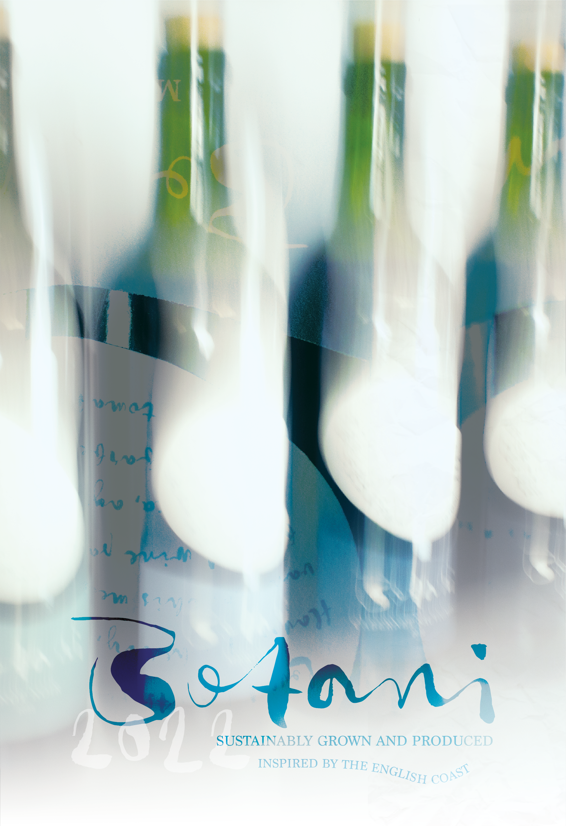
For the final senior exhibition project, students select anything they want to build/design/create and pitch it to the faculty of the art department for approval. I pitched a sustainable wine brand with packaging and advertisements.
Approach:
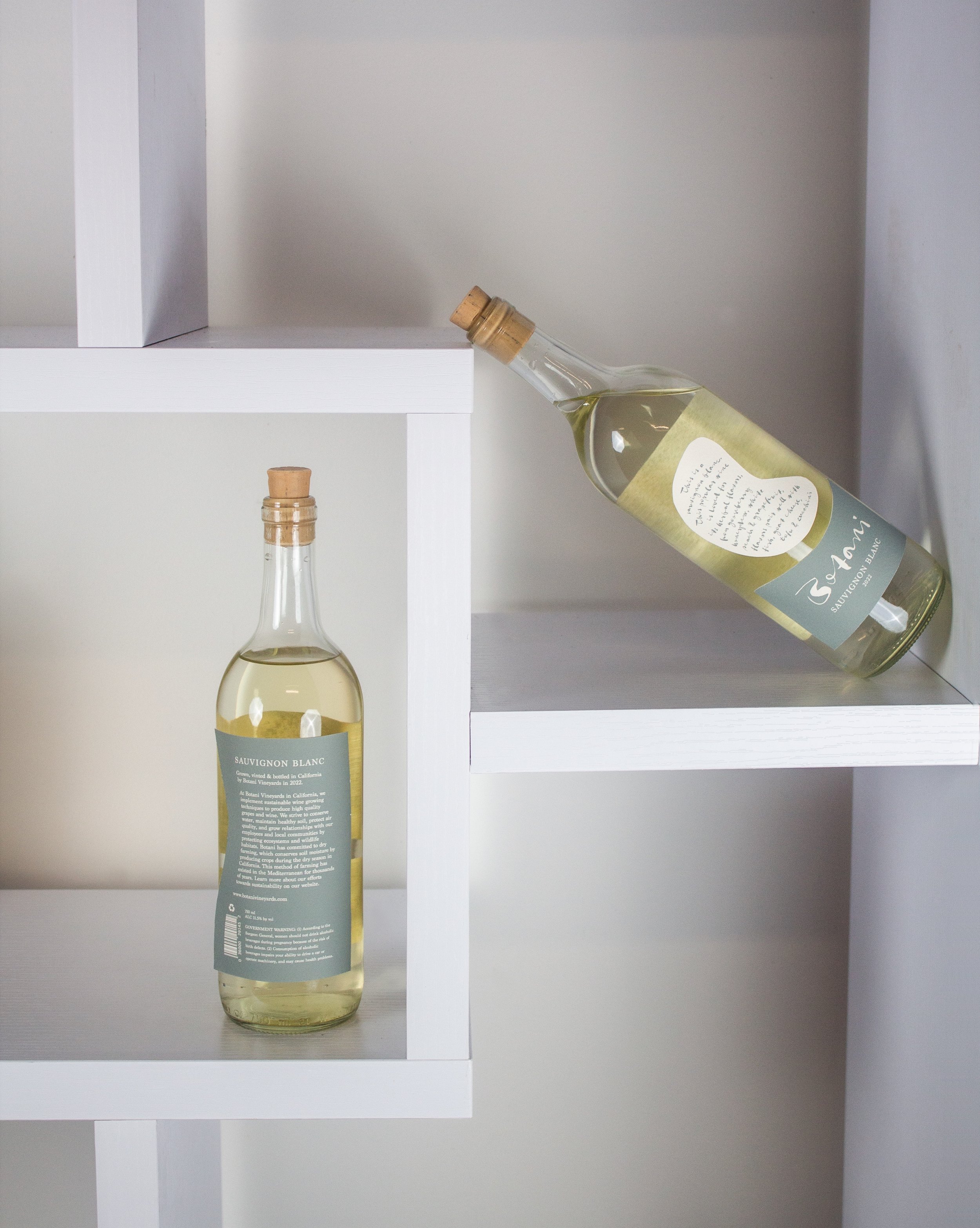
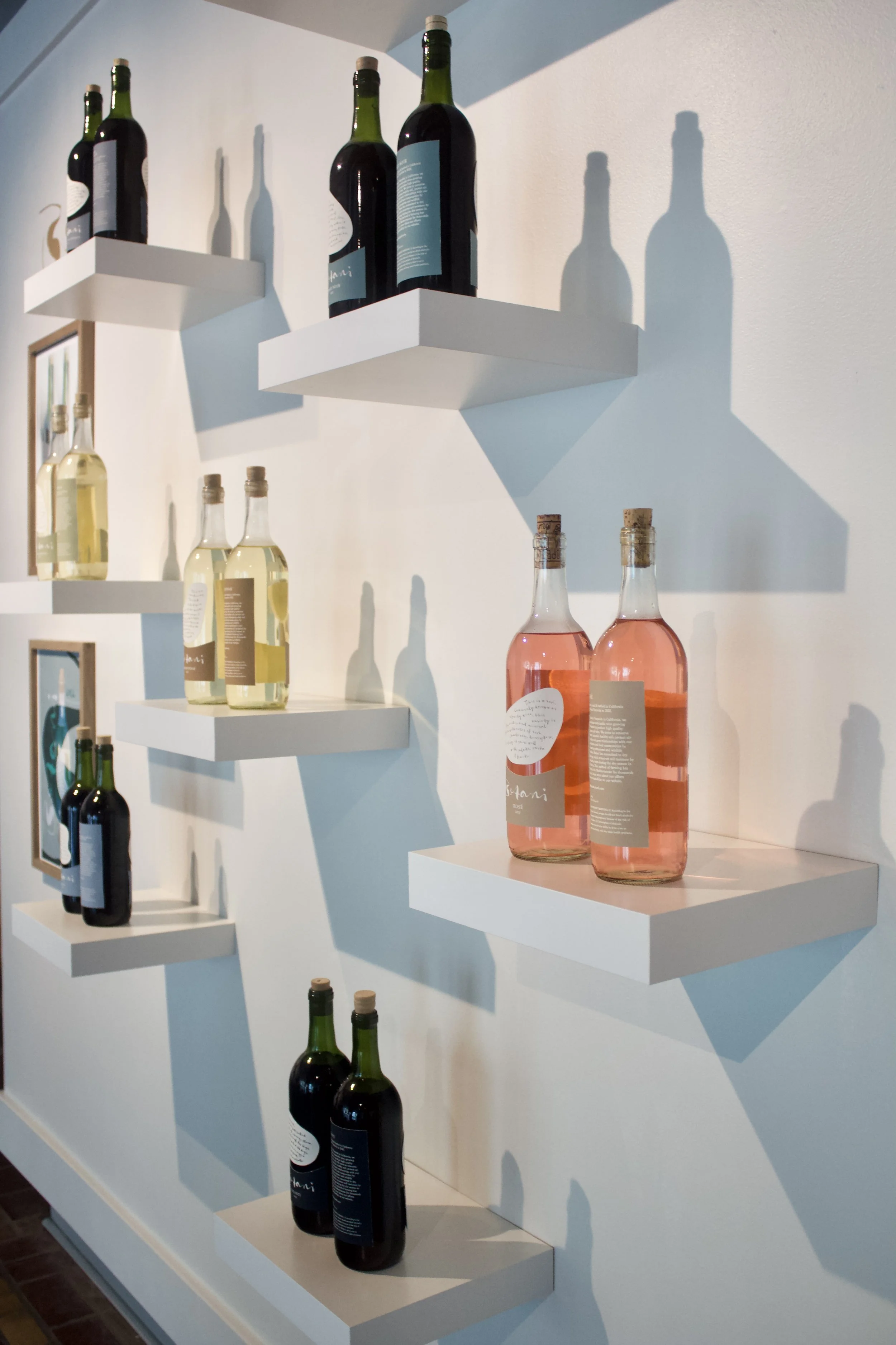
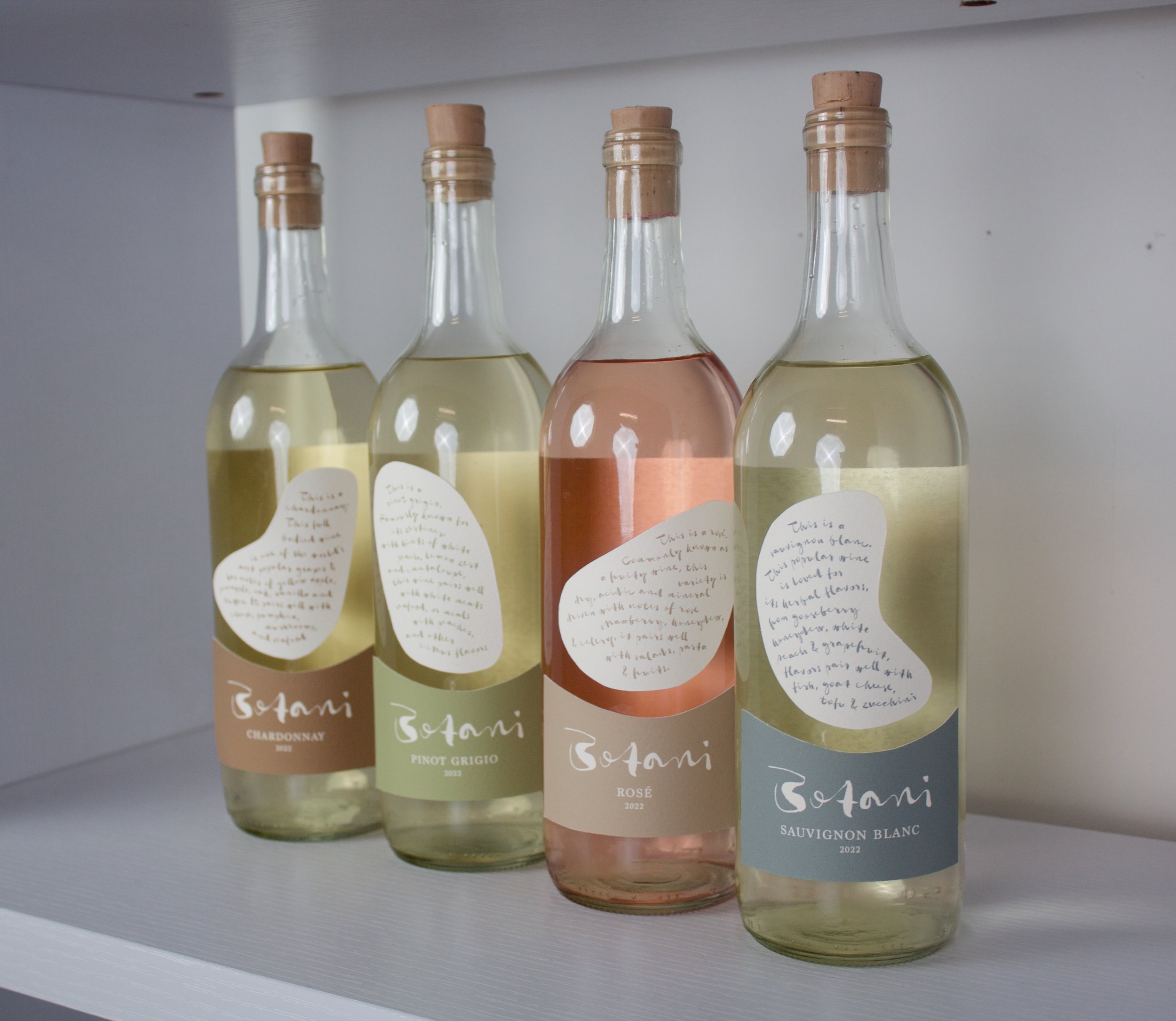
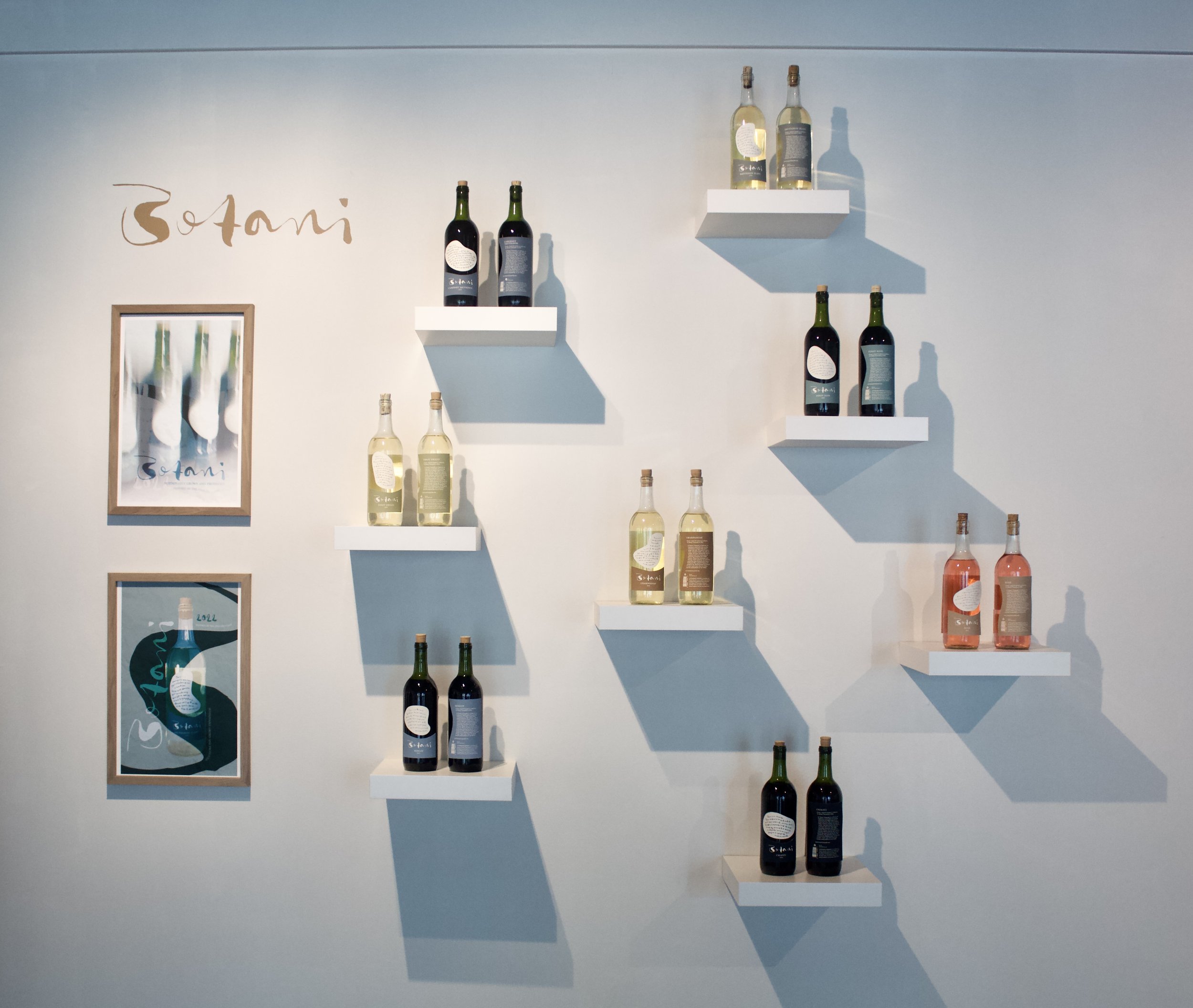
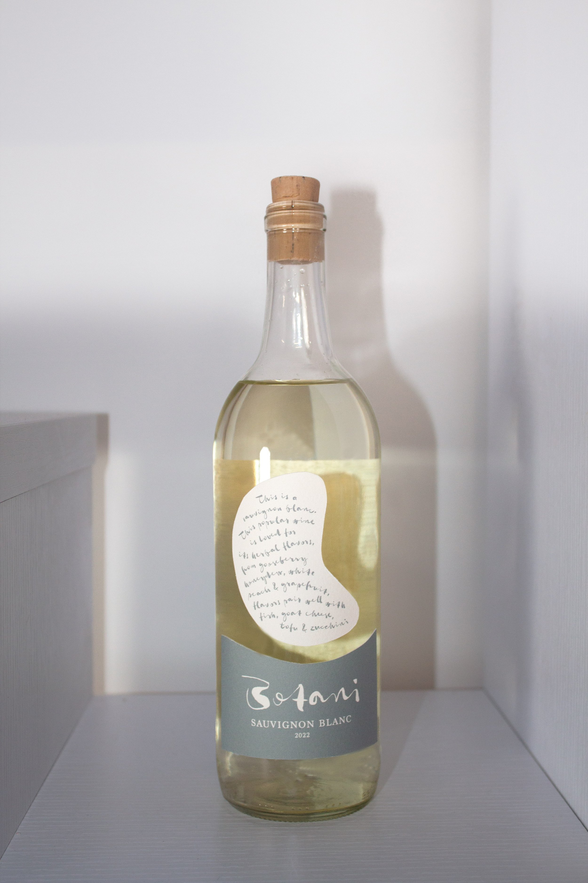
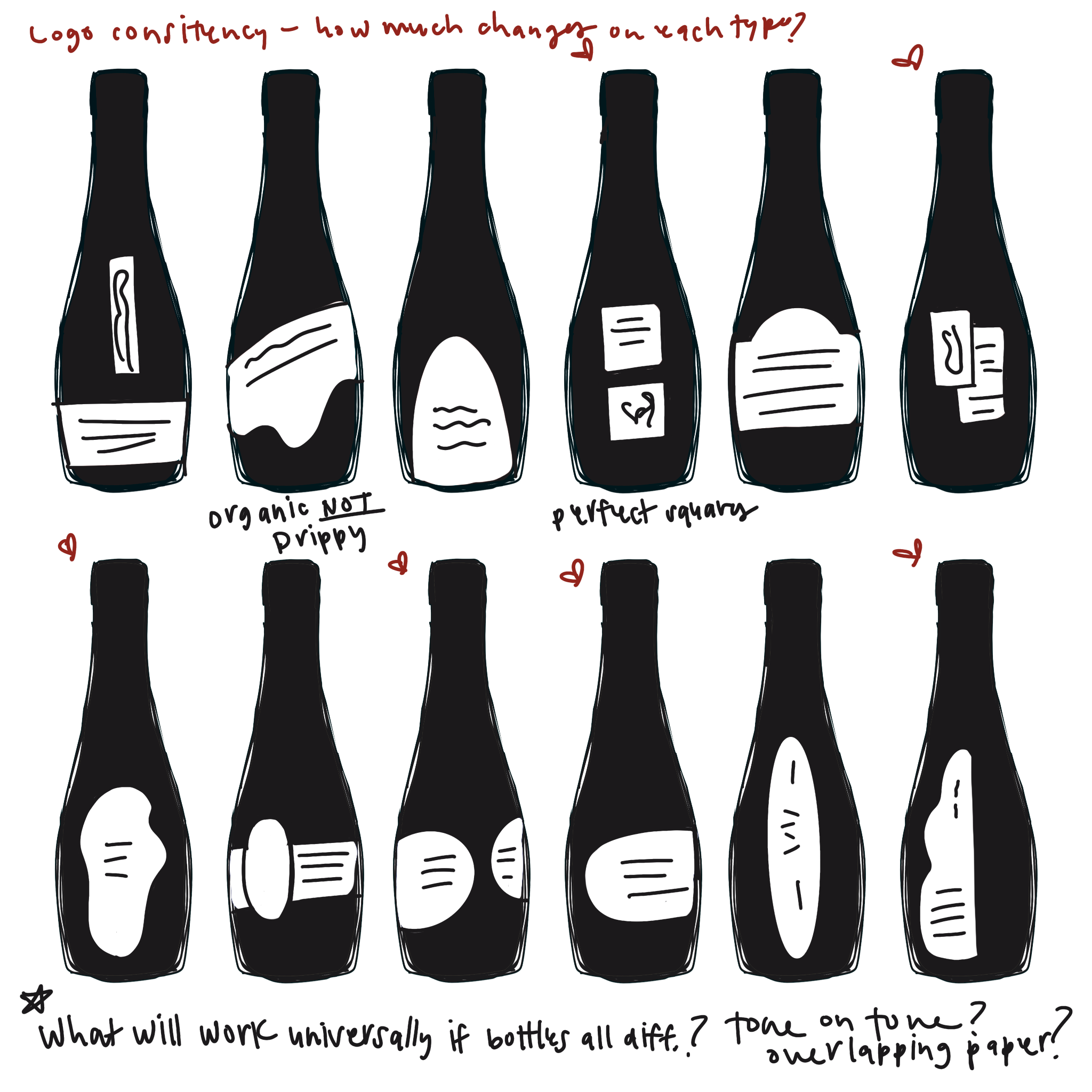
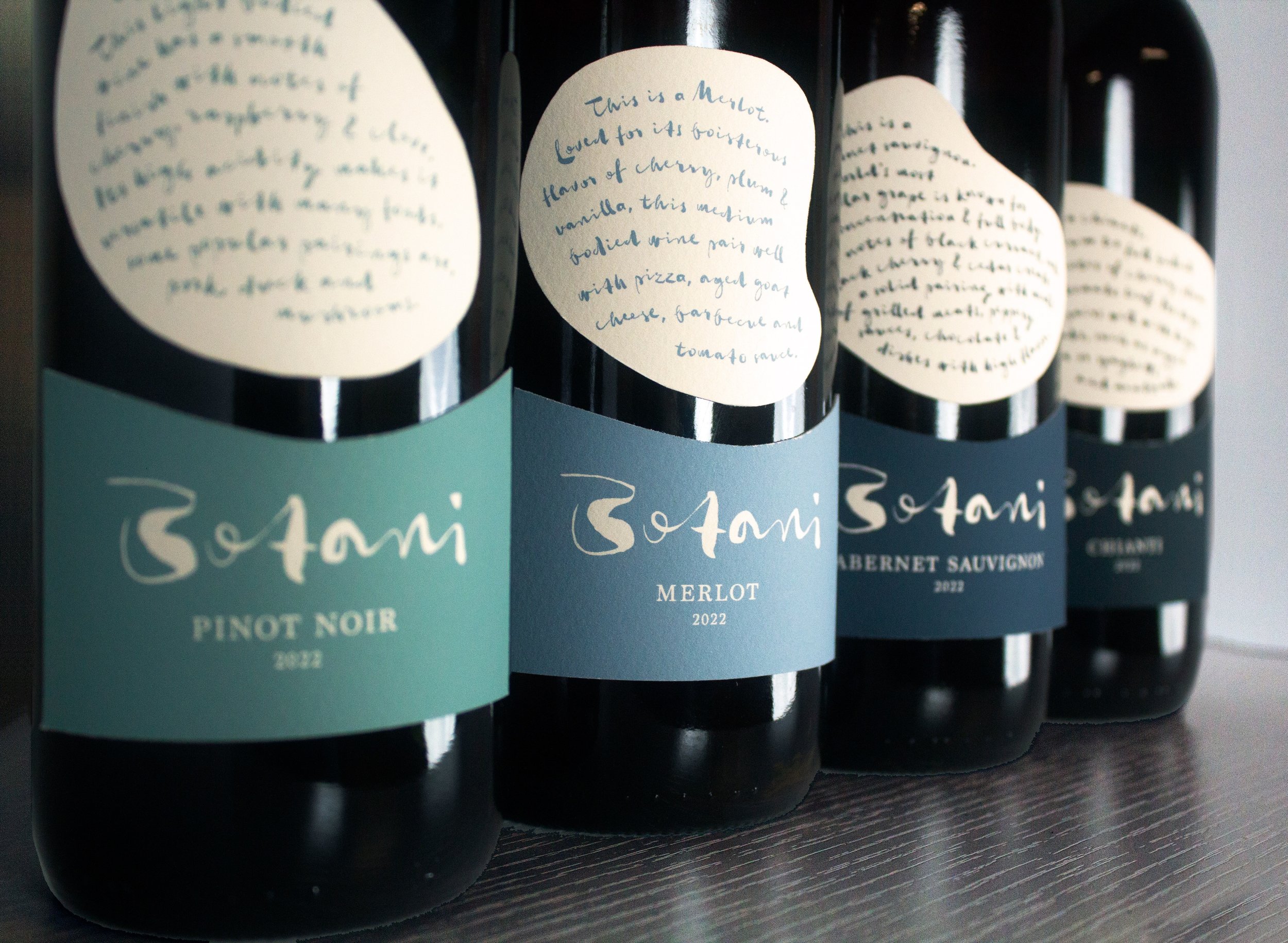
I spent a while brainstorming the name of the brand before any designing or brand identity was considered. Botany Bay is located on the the east coast of England and was a solo trip I took abroad. Due to the inspiration I felt there, this is where the name stemmed from. From there, I used the organic shapes of pebbles, the colors of seaweed, water and chalk cliffs to guide the design. Each wine type (there are 8 total) has a different organic shape than the next. The red wines have the cool blue tones and the whites have the warmer earthy tones. After printing the labels and applying them to my recycled wine bottles, I photographed them, and used them in the poster design.
Result:
This project was exhibited at the Stairway Wit Senior Fine Art and Design Exhibition at the McEachern Art Center in downtown Macon. It had a successful opening reception and was showcased for two weeks.
