brand manual
napier heights food co-op
Brief:
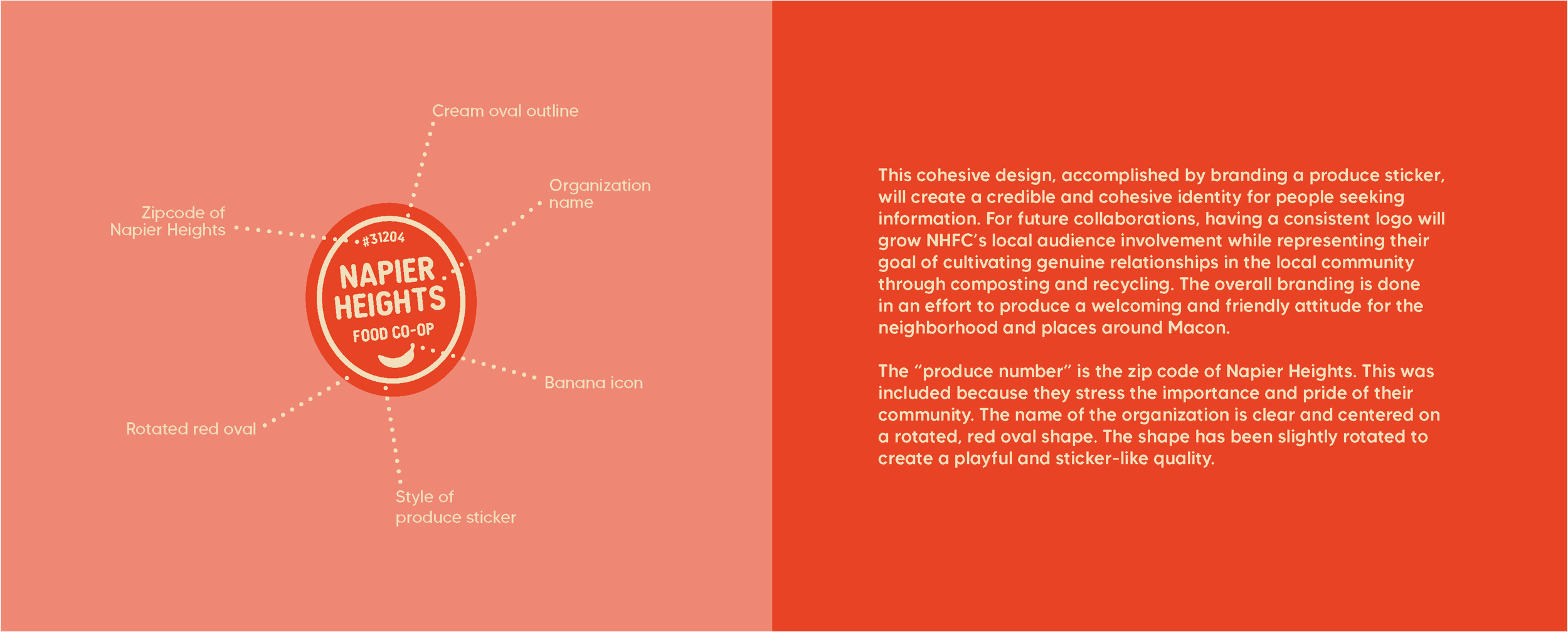
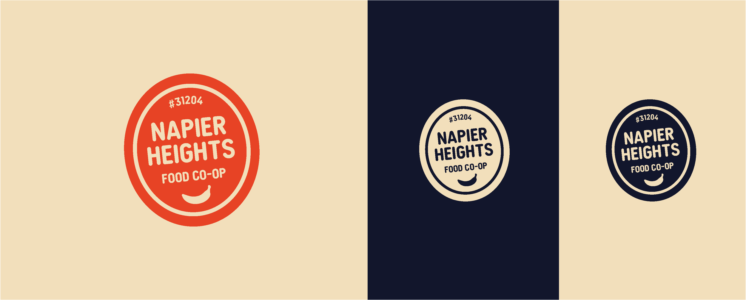
Design a brand manual for Napier Heights Food Co-op that presents a new logo design. This manual will showcase the development and overall brand identity concept through written content and imagery. The completed product will be given to the client in the final meeting where choices are shared.
Approach:
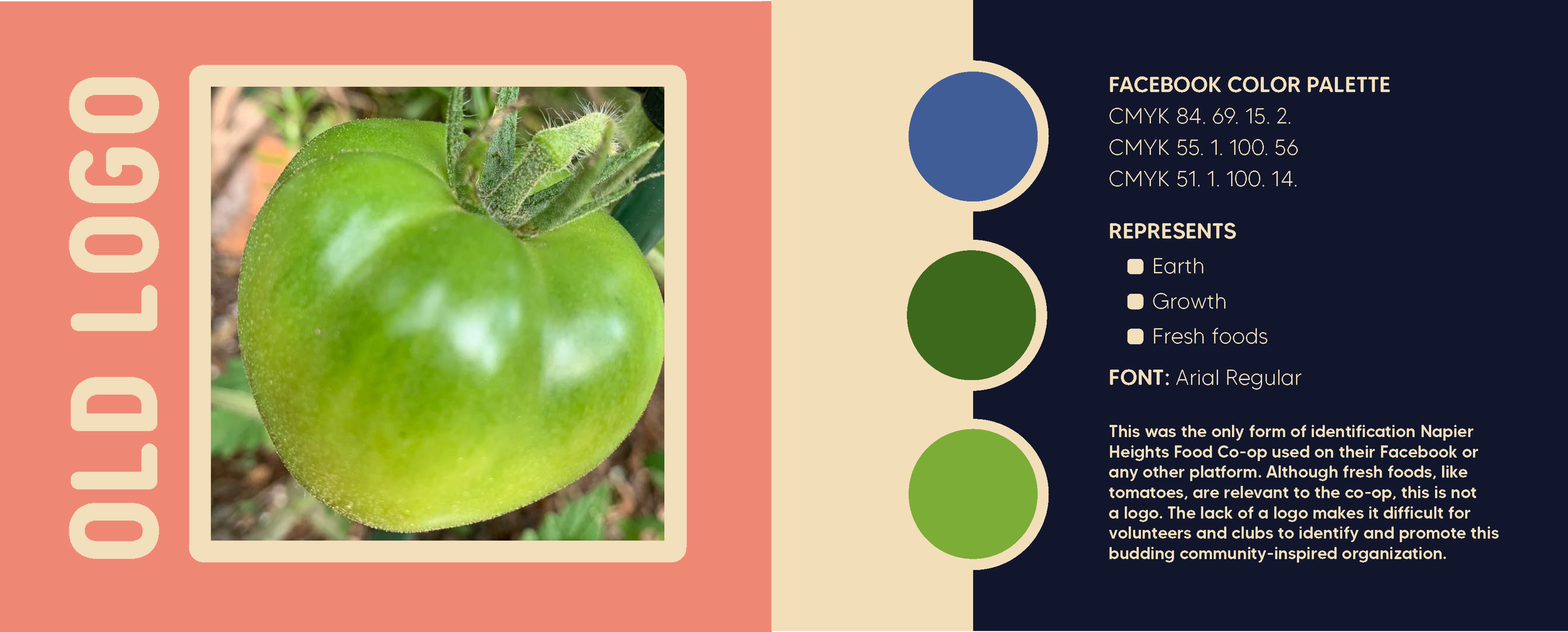
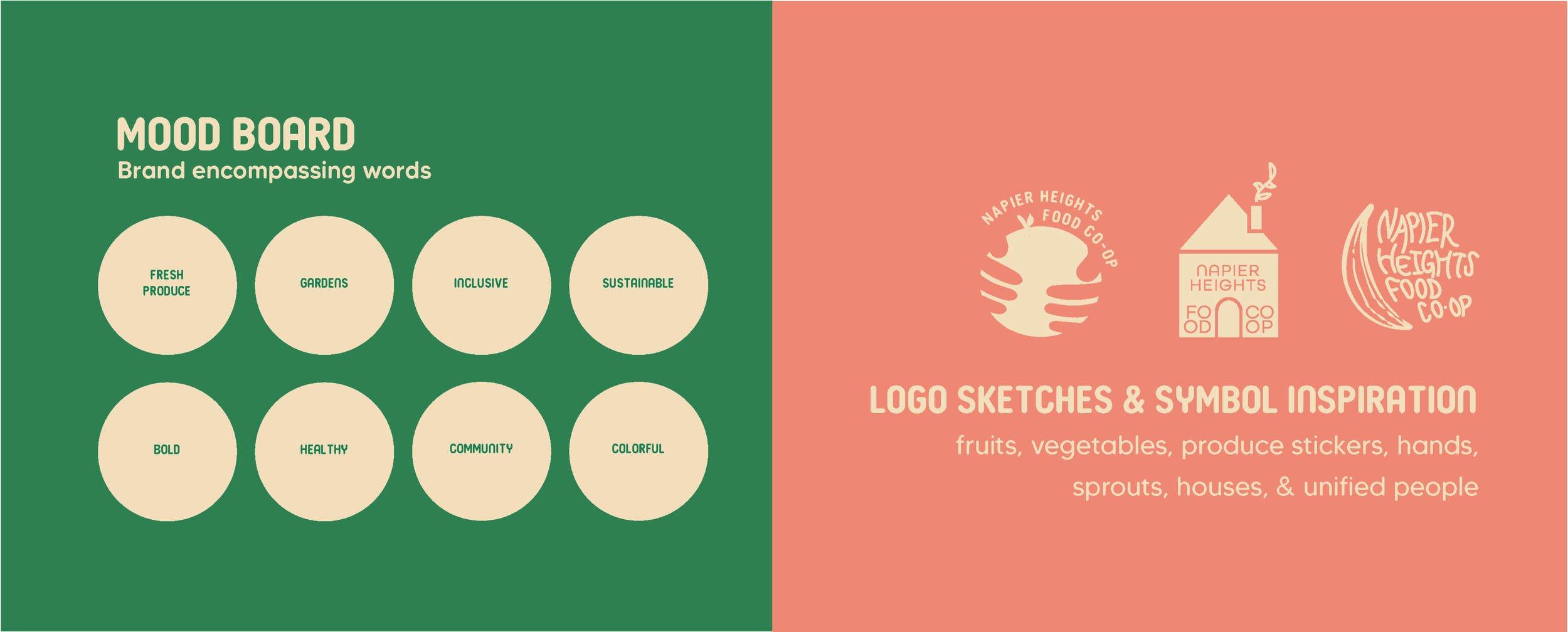
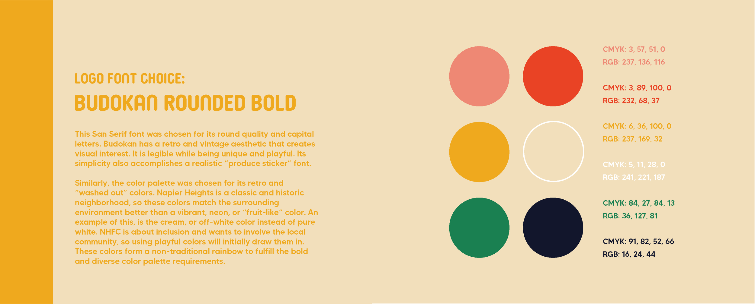
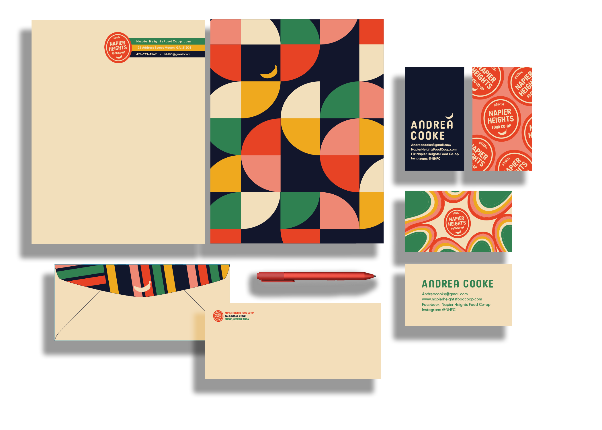
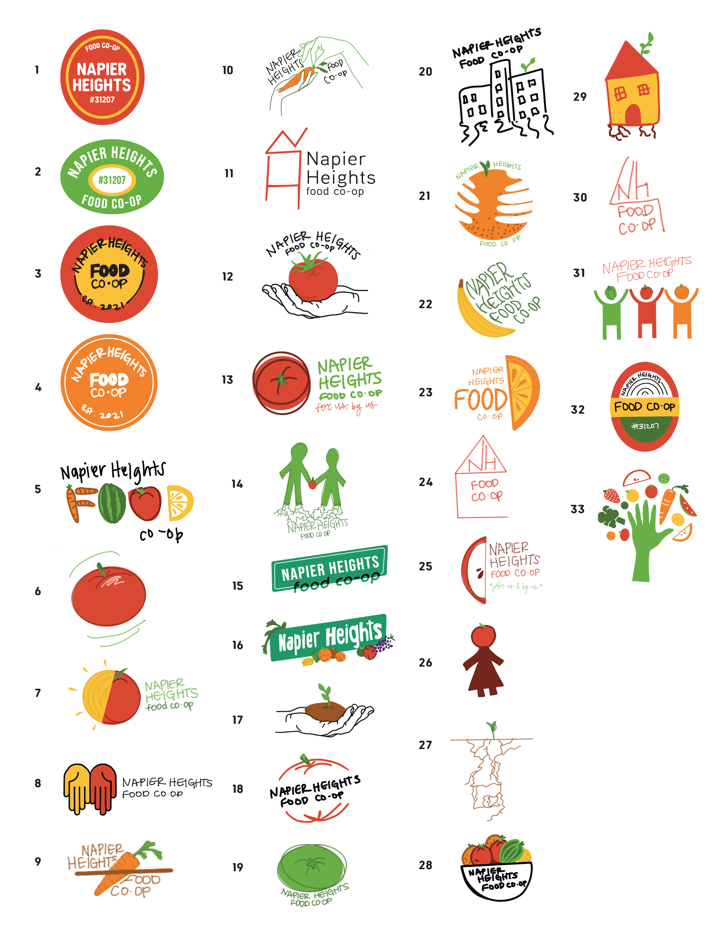
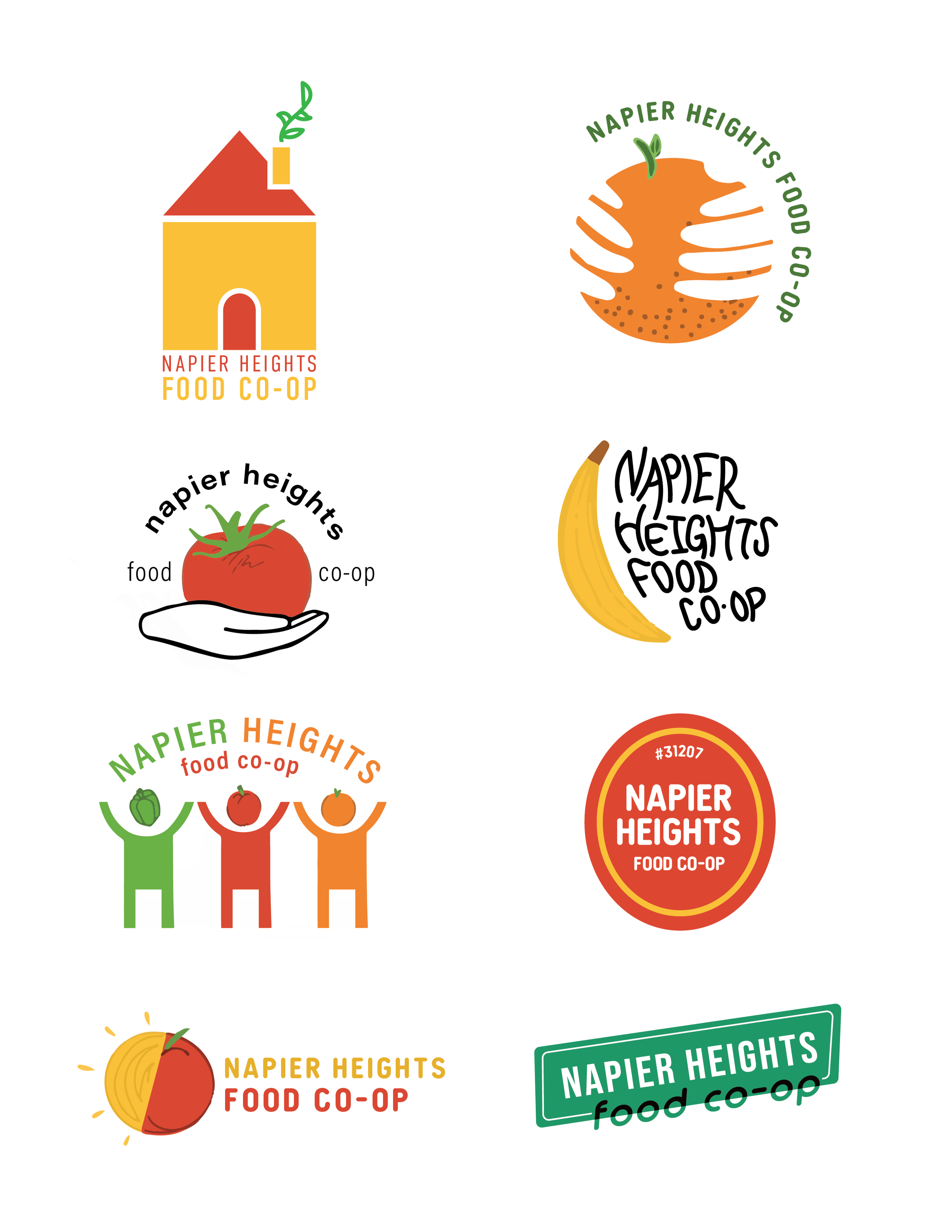
This co-op was brand new, had no logo, website, apparel, or social media other than an old inactive Facebook. They wanted their logo to feel inclusive, bold, and represent the Macon community. After many conversations and sketches I landed on a produce sticker-inspired logo. I created bold patterns with a retro feel that could be used elsewhere in the future, like the stationary below.
Result:
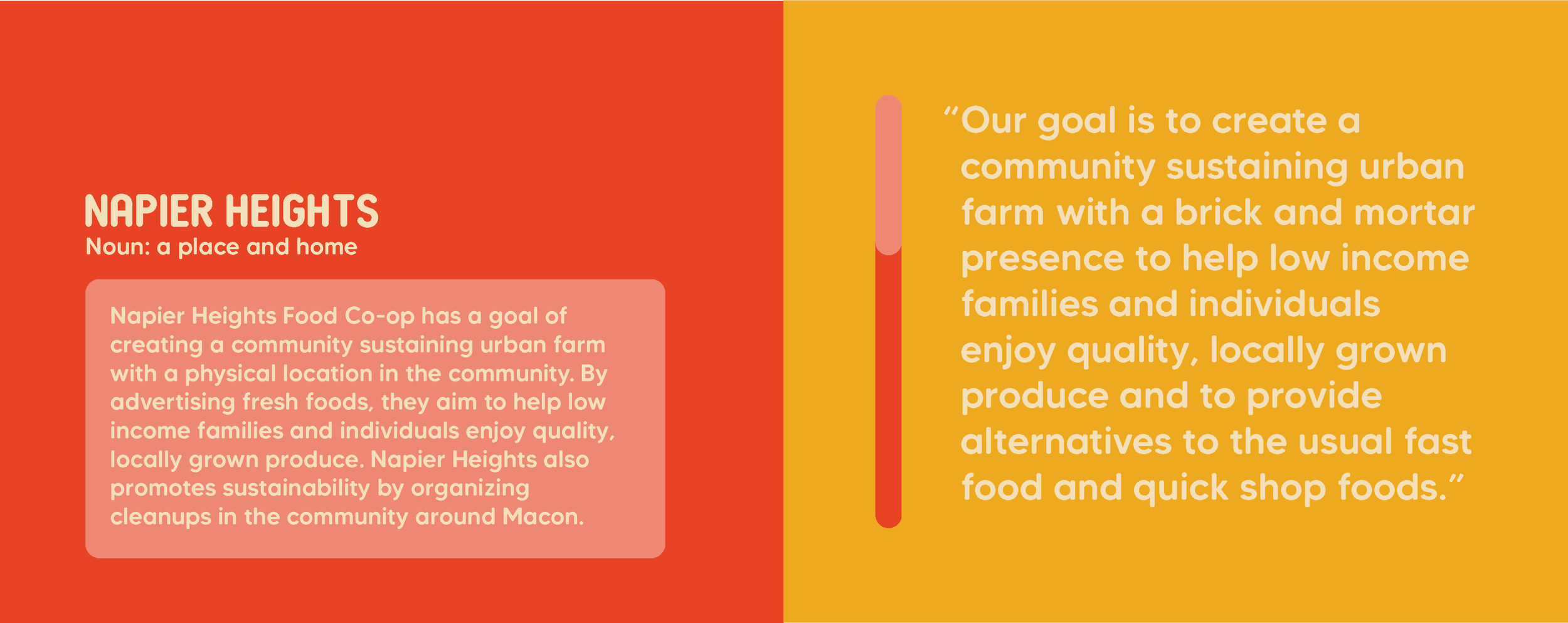
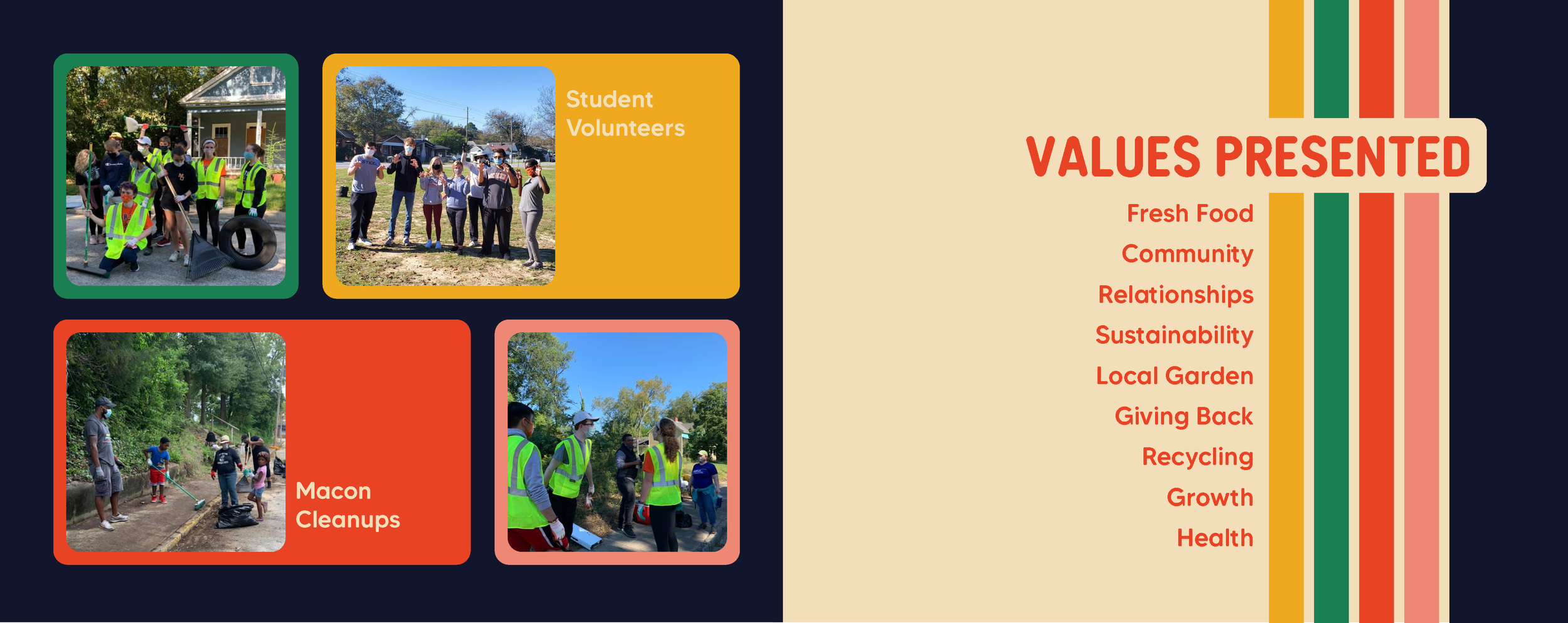
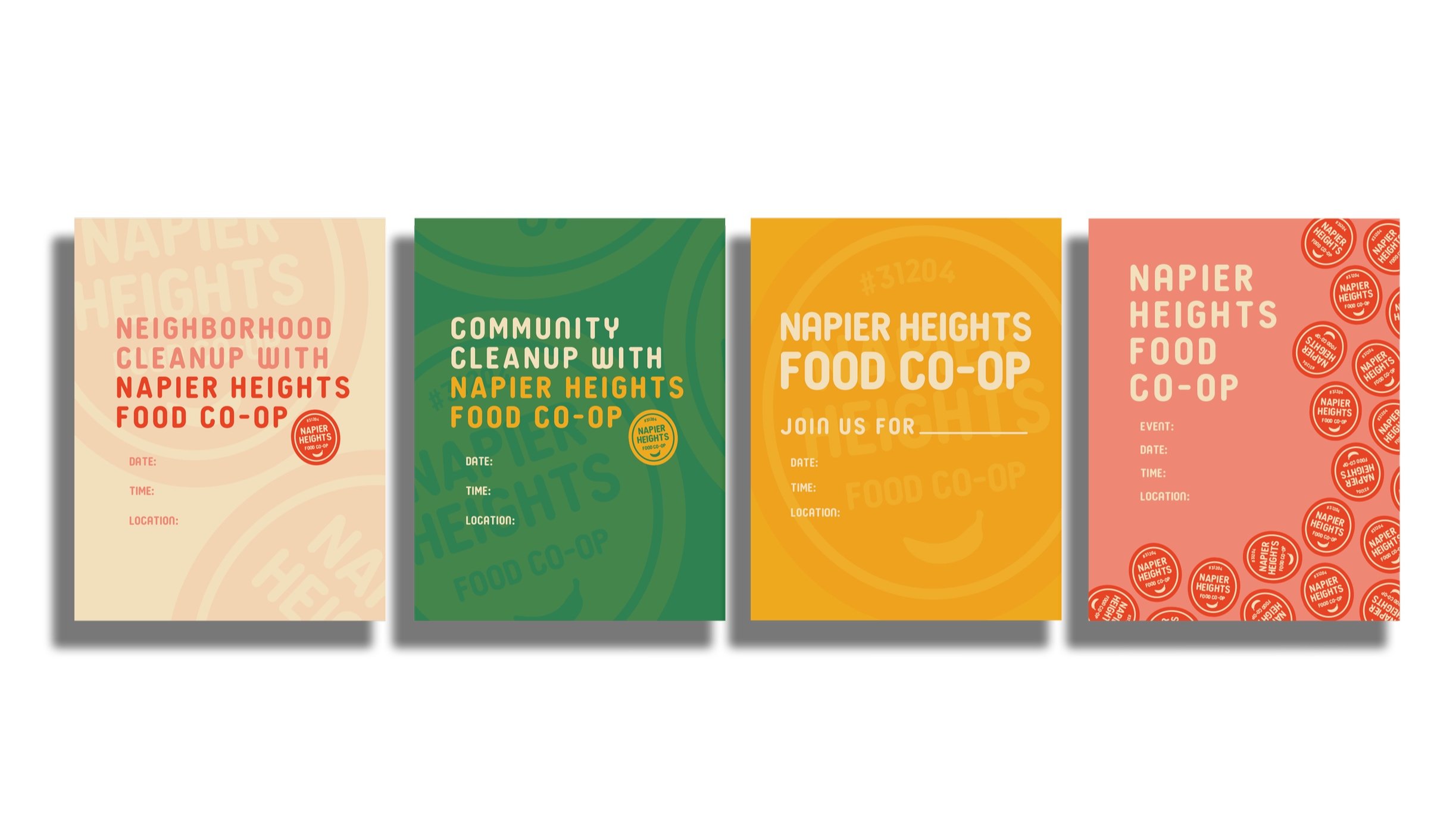
Below are a few spreads from the manual, along with the stationary system and posters for promoting neighborhood cleanups they could easily fill out with information.
